Learning module panels
Modules are made up of course pages. Panels are components of these pages, designed to make advanced content easy to develop without web development skills. The image below shows a page with two panel types — a Plain Text panel on the left and an Image panel on the right.
There are two categories of panel types: learning panels (covered here) and test panels.
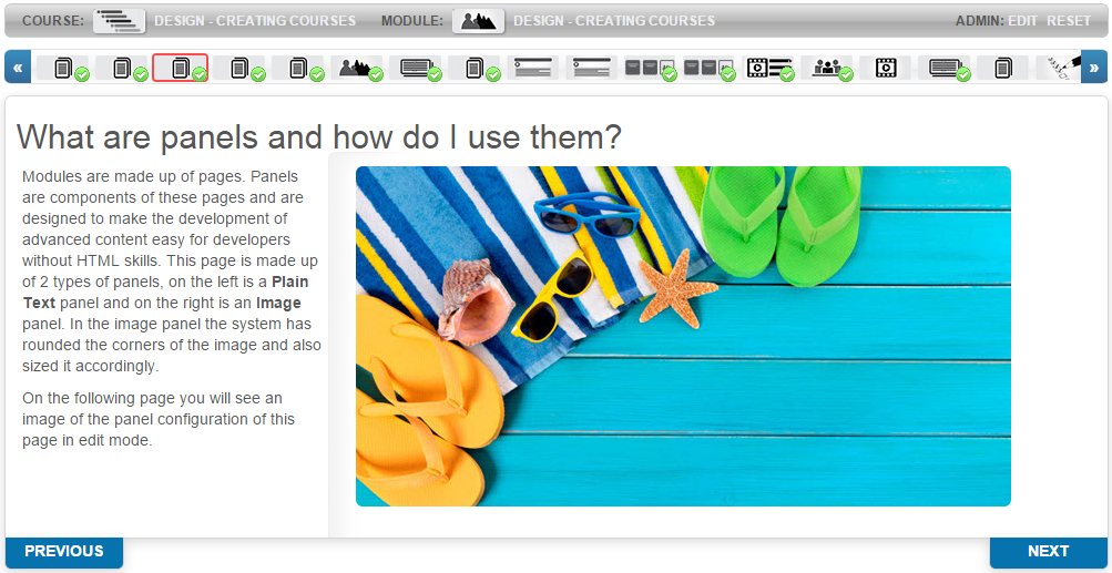
See Learning Modules for the general workflow of creating modules, pages, and panels.
Plain Text
Use the Plain Text panel to add text to a page. It has a standard editor.
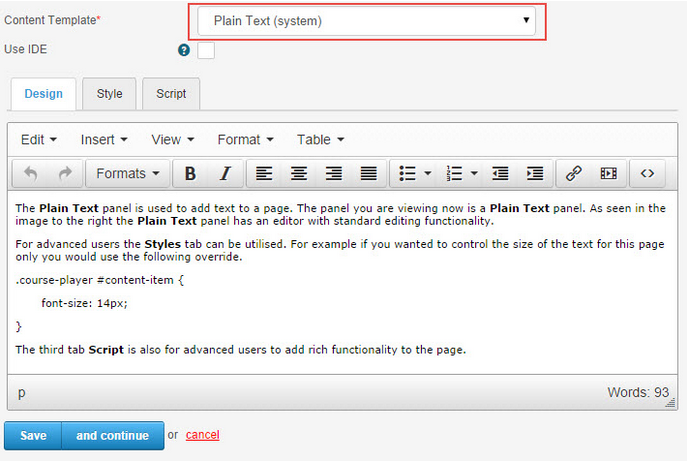
For advanced users the Styles tab can be used. For example, to control the font size for a single page:
The Script tab is also available for advanced users to add rich functionality.
Reveal List
A reveal list shows lines of text that are blurred when the page first opens. The learner selects a button to reveal the text line by line.
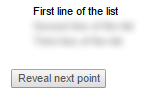
To add a reveal list:
- Add a Plain Text (system) panel.
- Create a bullet list using the editor.
- Enter Source code mode by selecting the source-code icon.

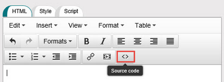
The first line of your list will have a <ul> tag. Add class="reveal" to the <ul> tag.
Note
When you add the reveal class, the list no longer has bullets or numbers — add them manually if needed.
<ul class="reveal">
  <li>First line of the list</li>
  <li>Second line of the list</li>
  <li>Third line of the list</li>
</ul>
Pop-up
A pop-up opens related text in a separate dialog box when selected.
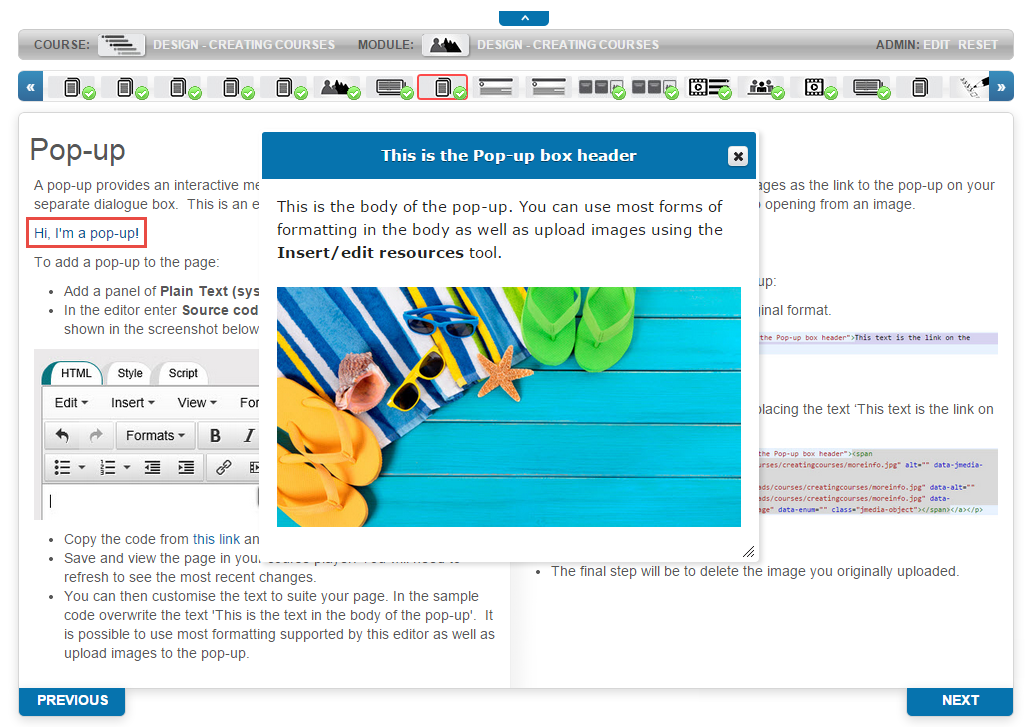
To add a pop-up:
- Add a Plain Text (system) panel.
- Enter source-code mode.
- Paste the following:
<p><a class="popup" href="#mypopup0" title="This text is the Pop-up box header">This text is the link on the page</a></p>
<div class="popup" id="mypopup0">
  <p>This is the text in the body of the pop-up</p>
</div>
- Save and refresh the course player to see changes. Customise the text to suit your page.
Tip
You can use most editor formatting and upload images to the pop-up.
Introduction
The Introduction Text panel type features animated text that slides in from the left of the screen. The text comes from the title and description of the module the page belongs to. A sentence is also added: "Please use the thumbnails above or the next and previous buttons below to navigate through the module".
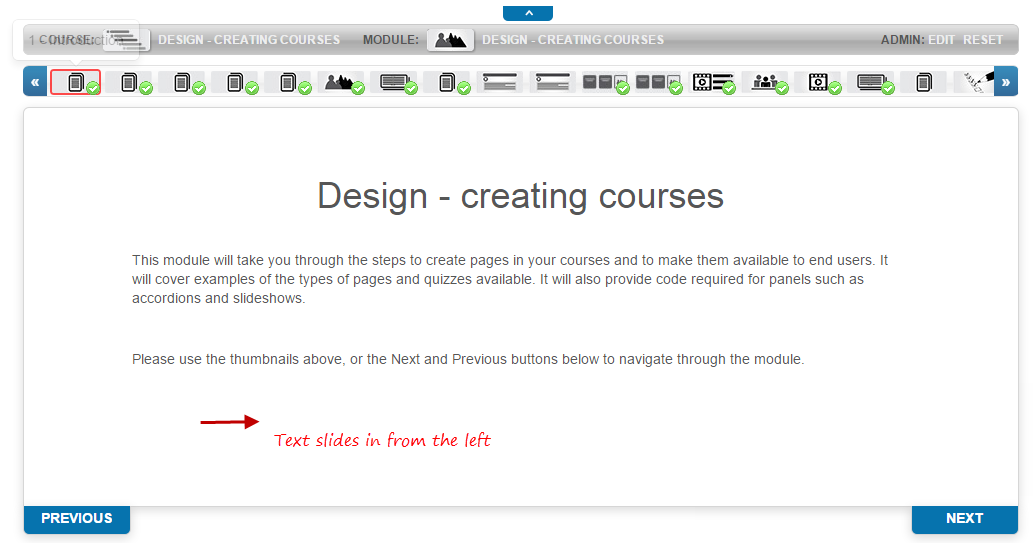
Note
Don't enter text into the panel itself — it won't display.
Accordion
The Accordion panel allows several windows to be stacked. All but one are minimised so only their captions are visible. Selecting one expands it. Only one window is open at a time — reducing information overload.
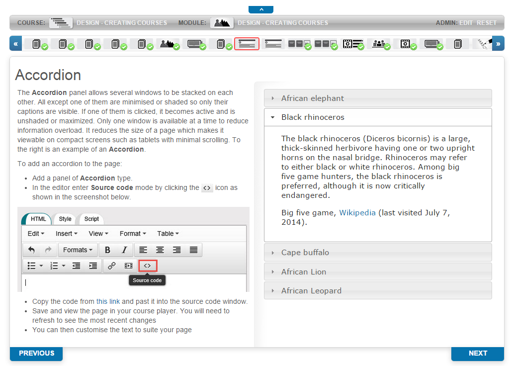
To add an accordion:
- Add an Accordion panel.
- Enter source-code mode.
- Paste:
<h3><a shape="rect">First heading</a></h3>
<div><p>Text for the first page</p></div>
<h3><a shape="rect">Second heading</a></h3>
<div><p>Text for the second page</p></div>
- Save and refresh the course player. Customise the text.
Tabbed Content
Like Accordion, tabbed content stacks several windows next to each other. Only one tab is open at a time.
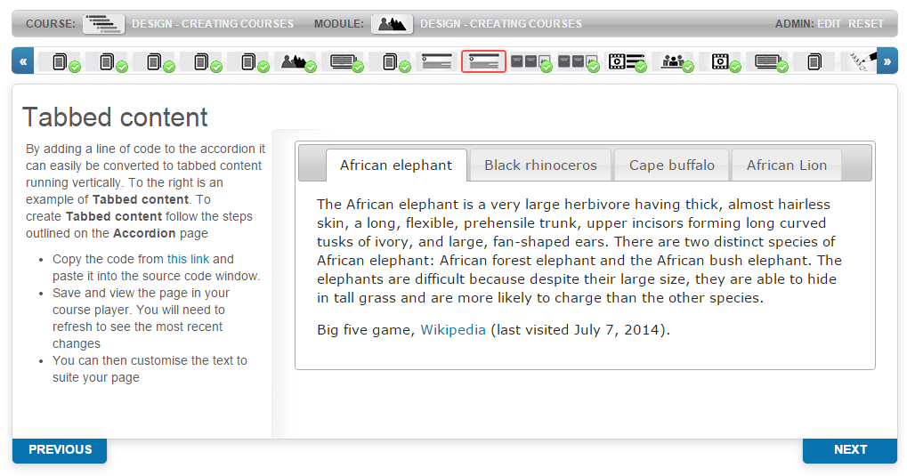
Add an Accordion panel and paste:
<div class="accordion-panel-options" style="display: none;" data-layout="top" data-completion="0" data-header="h3" data-overflow-ellipsis="false"></div>
<h3>First tab heading</h3>
<div><p>Text goes here</p></div>
<h3>Second tab heading</h3>
<div><p>Text goes here</p></div>
Reflection Tiles
Reflection Tiles flip over when selected. They can display text or images. The number, height, and width of tiles can be changed; the colour is inherited from the site theme.
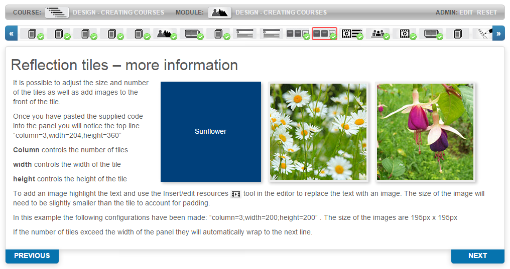
Add a Reflection Tiles panel. In source-code mode, paste:
<blockquote>column=3;width=204;height=360</blockquote>
<h2>Front of reflection tile one</h2><p>Back of reflection tile one</p>
<h2>Front of reflection tile two</h2><p>Back of reflection tile two</p>
<h2>Front of reflection tile three</h2><p>Back of reflection tile three</p>
The top line controls layout:
- column — number of tiles per row
- width — tile width
- height — tile height
To add an image, highlight the tile heading text and use the Insert/edit resource  tool. Images should be slightly smaller than the tile to account for padding.
Tiles wrap to a new line if they exceed the panel width.
Slideshow
The Slideshow panel displays multiple images in an organised, compact, interactive way. When you paste the supplied code, a table appears with rows and columns. Most rows don't require configuration — the main columns of relevance are Image and Overlay.
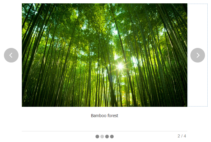
- Add images via the Resource Editor in the Image column.
- Type text in the Overlay column for slide captions.
- Upload an MP3 in the Audio column for slide audio.
- Search for timeout in the Name column to set automatic transition speed. 0 prevents automatic slide transitions; 4000 transitions every 4000 ms.
The slideshow code is over 1000 lines — copy it from the source file and paste into source-code mode.
Hotspot
A hotspot is an image with coordinates creating active regions. Each region becomes a pop-up. The example below has 4 hotspots — one per flower.
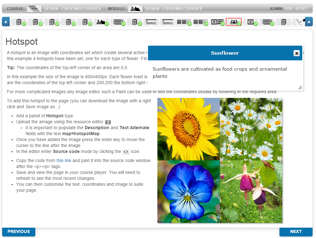
Coordinates use top-left = 0,0. For a 400×400 px image with 200×200 px inset regions, the sunflower hotspot is 0,0,200,200 (top-left to bottom-right).
To add a hotspot:
- Add a Hotspot panel.
-
Upload the image with the Resource Editor.
Important
Populate the Description and Text Alternate fields with
map=hotspotmap. -
After the image, press Enter to move the cursor to the next line.
- In source-code mode, paste:
<map id="hotspotmap" name="hotspotmap">
  <area shape="rect" coords="0,0,200,200" href="#" />
  <area shape="rect" coords="200,0,400,200" href="#" />
  <area shape="rect" coords="0,200,200,400" href="#" />
  <area shape="rect" coords="200,200,400,400" href="#" />
</map>
<h2>First hotspot</h2><p>First hotspot popup text</p>
<h2>Second hotspot</h2><p>Second hotspot popup text</p>
<h2>Third hotspot</h2><p>Third hotspot popup text</p>
<h2>Fourth hotspot</h2><p>Fourth hotspot popup text</p>
Video
The Video panel embeds a video without code. Recommended format: MP4. Other supported formats: M4V, F4V, MOV.
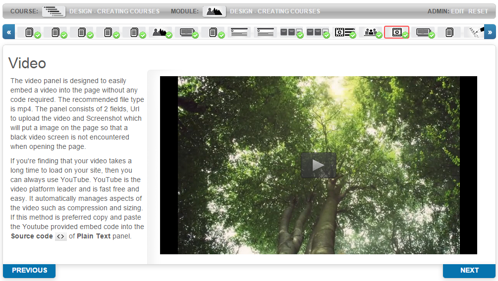
To add a video:
- Add a Video panel.
- Upload a video using Select video.
- Optionally upload captions (SRT, VTT, TTML, DFXP).
- Optionally select an image to display before play.
- Use Edit metadata for Text Alternative, video size, and captions.
For very large videos, use YouTube instead — paste the YouTube embed code into a Plain Text panel's source code.
SCORM
The SCORM panel displays simple SCORM courses inline within the course player. For complex SCORM-tracked tests and questions, use the SCORM learning asset instead. Create the SCORM course in a third-party tool like Articulate.
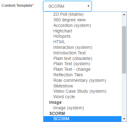
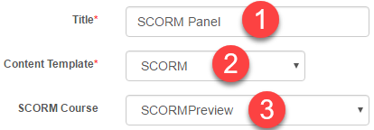
To apply a SCORM to a course panel:
- Enter a Title.
- Select SCORM from Content Template.
-
Select your SCORM Course.
-
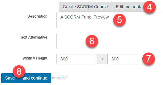
Select Edit metadata.
- Optionally enter Description and Text Alternative.
- Optionally enter Width and Height.
-
Select Save.
Module Progress
The module-progress script calculates a user's progress in the module. When a user reaches this page, a notification appears advising whether they've completed.
Add a Plain Text panel and paste in source-code mode:
<div class="hidden-message show-when-module-complete">
  <p>Well done, you have completed this module.</p>
  <p>When you select <strong>NEXT</strong> you will be taken back to the course homepage.</p>
  <p>To continue working select the next module.</p>
  <p class="instruction">Select <strong>NEXT</strong> to return to the module homepage.</p>
</div>
<div class="hidden-message show-when-module-incomplete">
  <p>Although you have reached the end of the module, one or more pages still need to be completed.</p>
  <p class="instruction">Review the top menu bar and check that each thumbnail has a green tick.</p>
  <p class="instruction">When you have done this, return to this summary page to confirm completion.</p>
</div>
Customise the text as required.
Settings
There are no platform settings specific to learning module panels — they're configured per-panel via the course designer. See Learning Modules for module-level settings and Templates for creating custom panel content templates.